We Love Movies
A new brand direction proposal for a Fandango web application increasing user engagement and ability to discover new movie content while following best practices for a user friendly experience
The time-lapse displays one of 6 people for user testing. The main pain points that came up revolved around certain selections that could provide more clear calls to action.
The UI mockups bring a minimal approach to the Fandango web app homepage.
The Fandango Prototype Click Through shows the clear path process pages a user would encounter after deciding to purchase movie tickets for Dunkirk. The back and next button at the bottom or clicking on one of the category stages would allow for a clear path for editing options.
This is an interaction demonstration of the Fandango Home page showing how a user could quickly view the trailer by selecting a specific album, seeing more information about the film while creating an interaction by flipping the album cover, clicking the search tab on the bottom left and also viewing the users dashboard to view rewards, account info, theaters.
This is the latest iteration of the wireframe process showing a user scenario choosing a film [Dunkirk] and going through a series of progress step pages that divide the different stages of purchasing a ticket into 5 phases [Day . Theatre . Time . Seating . Pay & Confirmation. After user testing, this proved to be the best approach to have a clear call to action on each page.
The first step in the process started with analyzing what the pain points were of the Fandango web application. By viewing other movie web app competitors like AMC, CMX and out of category examples such as MoviePass, it became apparent to focus on designing new alternatives for the visual layout of content while also pushing for a more engaging user experience. With this in mind, wireframe sketches were drawn up with a clear emphasis on primary and secondary composition of elements to create visual hierarchy.
After going through mood board inspirations with mobile UI interactions for movie content, the ideas for a new brand direction was to hone in on engaging users by showing movie content in a dynamic composition utilizing full screen visuals and sophisticated icons for intuitive selections.
The initial digital wireframe flow to purchase tickets for a movie had too many steps for the user to choose per page. To solve the problem, the flow chart brought clarity by breaking up steps into seperate pages for more prioritization with a clear path and better overall user experience.
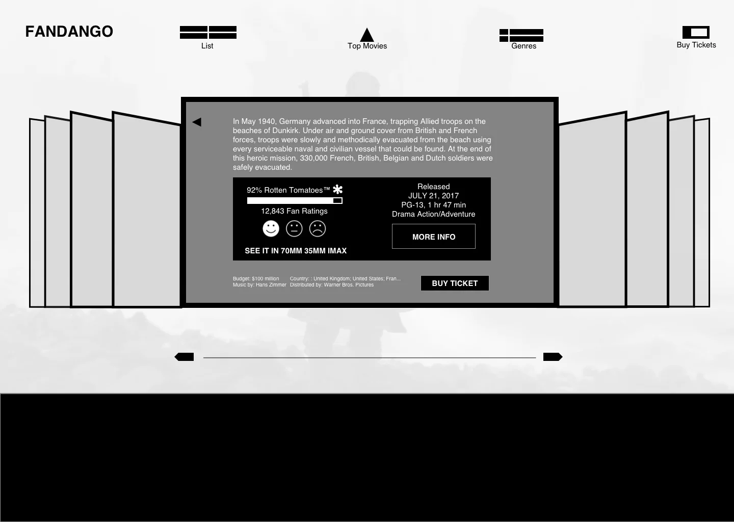
The initial digital wireframe design was concentrated on user engagement combined with brand new user experience for purchasing movie tickets. User engagement was addressed with a dynamic album cover layout that gives a primary focus on the content being viewed. This first iteration brought a new version of what Fandango could propose for their web application.
To understand the functionality of different parts on the web app wireframes, the noted annotations provide clear descriptions of each element including interaction explanations that a developer could oversee once the product would go into the building process.

The Fandango mobile UI design version shows what a user would see in the spotlight tab of the navigation allowing them to quickly swipe through different movie trailers on full screen, swipe down to exit and also read a short plot summary.


